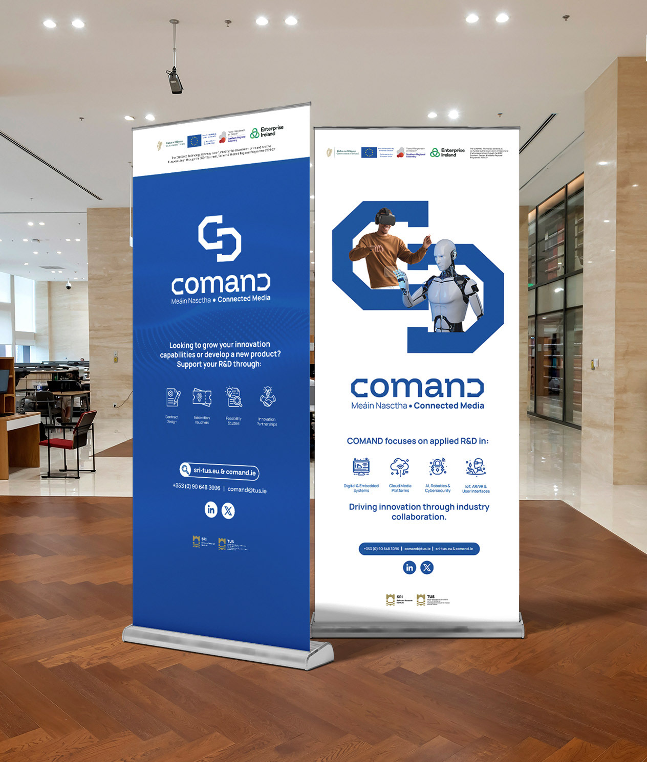
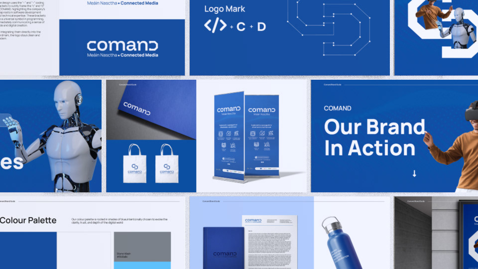
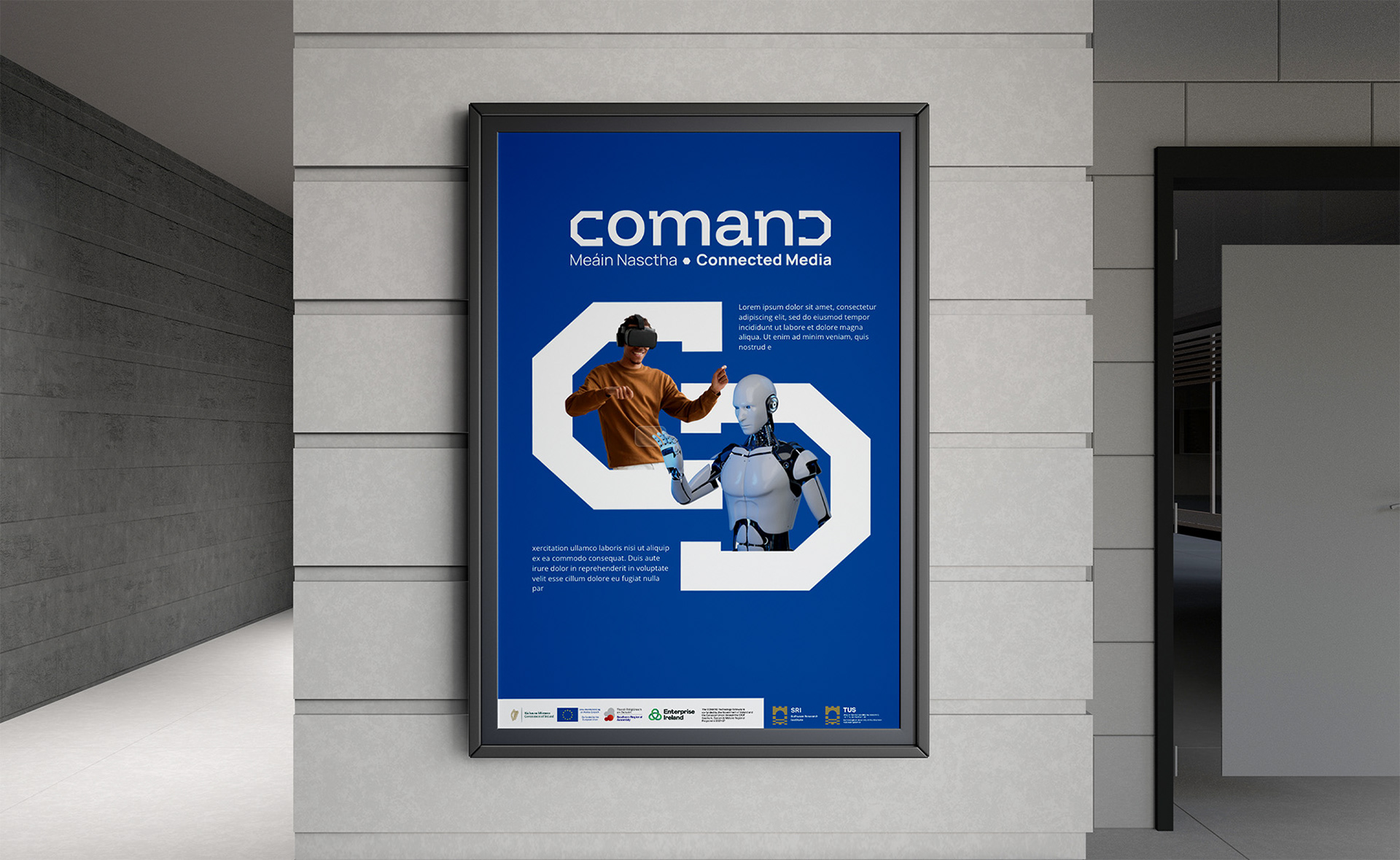
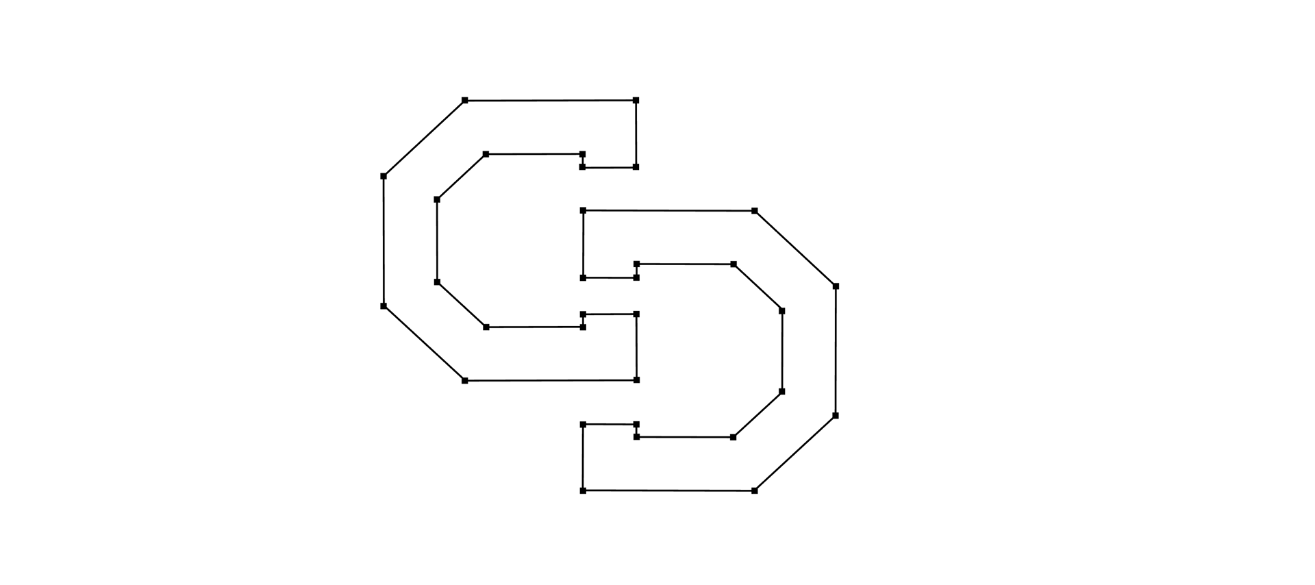
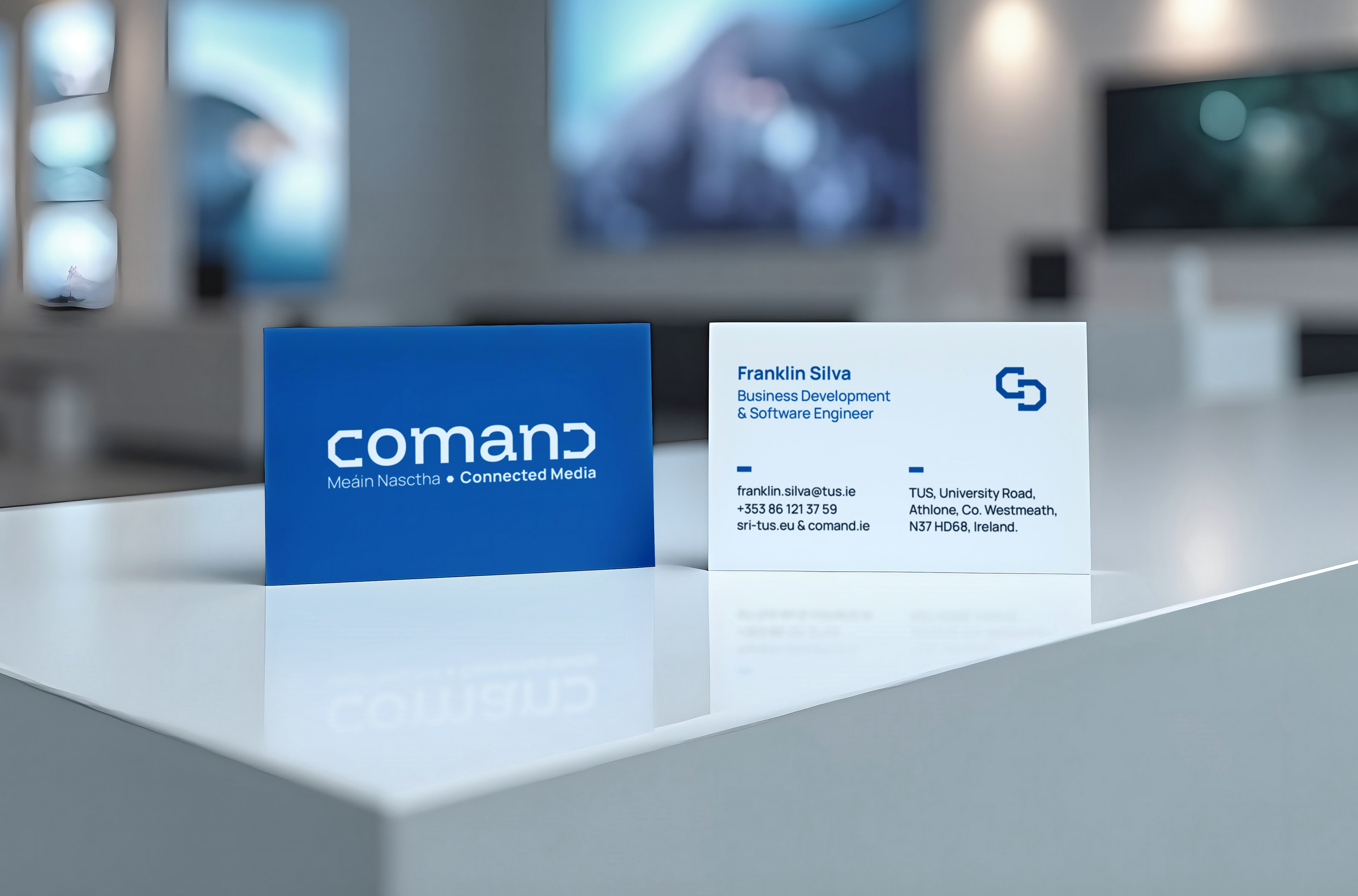
The new Comand logo brings together the “C” and “D” from ‘Comand’. Shaped into bracket-style forms, inspired by tech and coding visuals, they give the brand a clean, modern look while still staying practical and easy to use. They also work as simple graphic elements used across the wider identity, helping keep all print and digital designs consistent and recognisable.


Comand
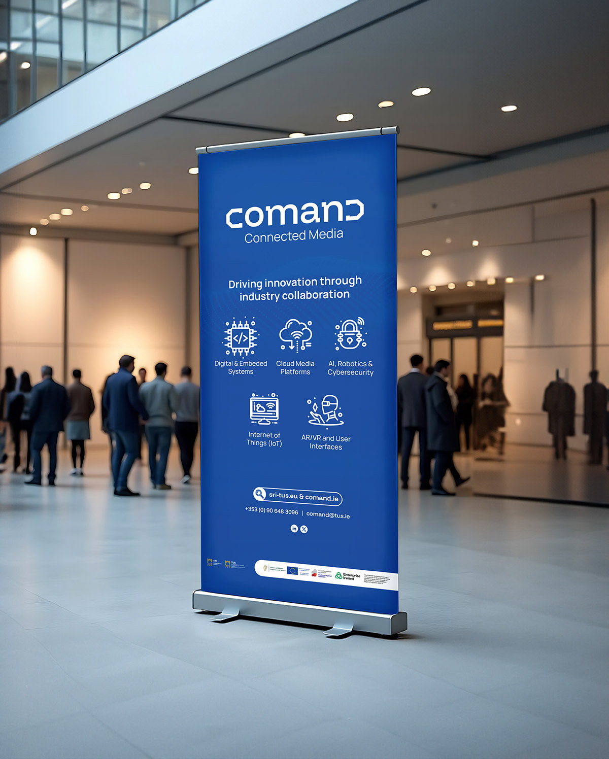
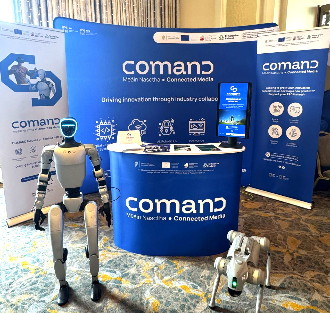
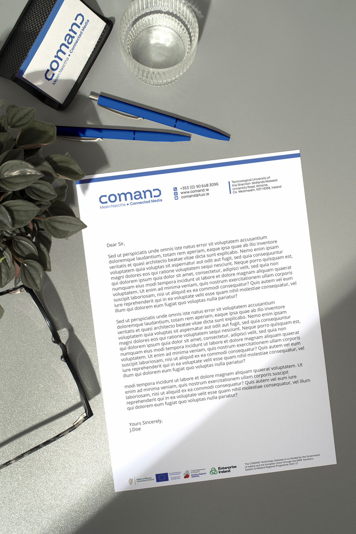
This project involved a complete brand refresh for Command, focused on modernising their visual identity while strengthening clarity, consistency, and trust. I redesigned the logo, refined the typography and colour system, and developed a comprehensive brand framework that could scale across print, environmental, and exhibition design. The refreshed identity was applied across brand guidelines, letterheads, brochures, tote bags, pull-up banners, flags, wall graphics, exhibition stand design, PowerPoint templates, and social media assets, ensuring consistency across all touchpoints. The result is a flexible, future-ready brand system that supports clear communication, professional presentation, and long-term growth.